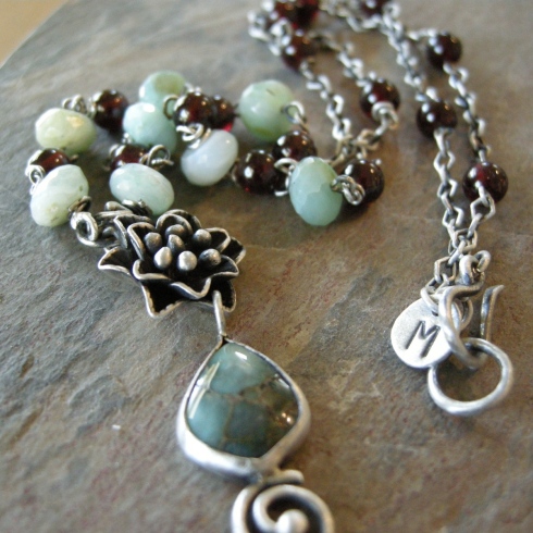
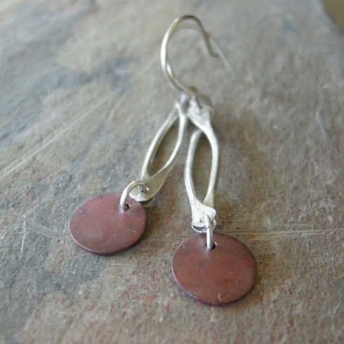
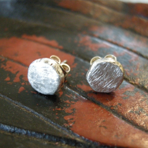
I’ve been trying a new background for taking my jewelry photographs.
But I’m just not sure.
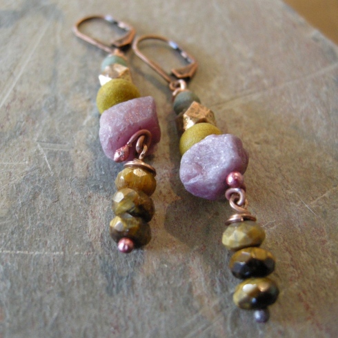


I usually use this darker background, but was beginning to wonder if it wasn’t a little too dark.
I have a light box that I got for Christmas before last, but I haven’t quite got the hang of it yet. The photo’s come out washed out.
To be honest I get a bit irritated with taking the photo’s. If I wanted to do photography I would have taken a course, but I don’t want to be a photographer. I don’t really want to pay anyone to take them either. Call me cheap, but it’s true.
I bought a book on taking good photographs once, but it bores me just to look at the front cover. I have a decent camera, I think, but it worries me that it has a lot of buttons on it that I don’t use. What if they’re important?
Maybe this background is better.


Or perhaps I should just stick with the original one.


Looking at them here I do think the top ones are worse.
But I just don’t know …
Then there’s the whole problem of size. Sometimes it can be deceptive. So I need a neck model, and a wrist model. But, I want a nice looking neck, and a decent sized wrist.
I’m telling you – nothing but decision-making problems here today.
Makes me wonder if I should even get out of bed.
–
I like the new background! I especially like it when you lean the items against the edge. It gives a lot of dimension. Good luck!
🙂 thanks
Love the jewelry and the backgrounds – particularly the black/red stone-looking one. And as Paige noted, the leaning pose gives great dimension. I’d say you’re on to something!